ShopDreamUp AI ArtDreamUp
Deviation Actions
Suggested Deviants
Suggested Collections
You Might Like…
Description
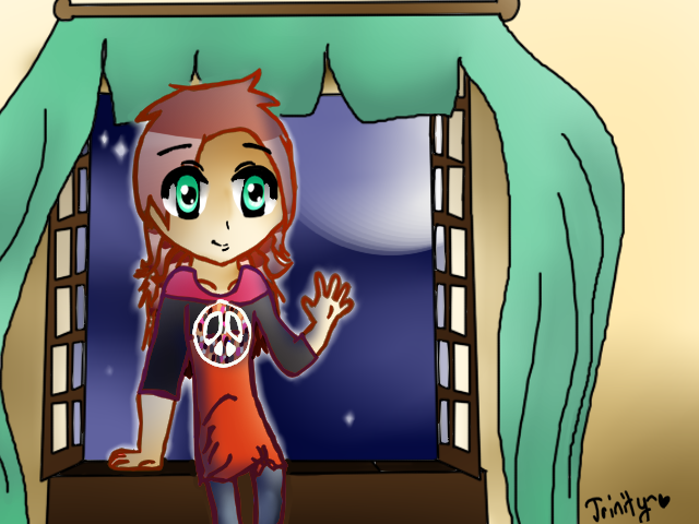
I think I'm getting better at anime 
Help me improve by sending a critique my way ^^
Help me improve by sending a critique my way ^^
Image size
640x480px 248.12 KB
© 2012 - 2024 JayneCroyez
Comments2
Join the community to add your comment. Already a deviant? Log In
So, the hair.
The shading is pretty off. The highlight is too much. Since you have the moon showing, there should be a slight glow on the right side of her (>) Plus, you should draw the part in her hair. So it looks more realistic. Also, add more layers to the hair, to make it seem more flowy. The neck is too fat. Like she's shruging. The left arm/shoulder (<) should be slightly higher than the right one. Since it's baring the weight of the body. While the right side is in a relaxed waving position. You should add folds to the cloths as well. To make it have the more, realistic(ness) to it. Like where the arm is bending, that is a beginners fold. And since the sleeves seem to be 3/4, they should be folded too. Unless they are really baggy. Then you should still define that. The collar bone is slightly displaced. Alittle bit father down, and not curving that much down. The seem alright. Just add more shadows and highlights to it, and your set. But you might want to lessen the lineart on the eyes. So then that's not the first thing they look at. It should be the character as a whole. The curtains don't seem as flowy as they should be. Since I believe you were trying to portray them to be flapping in the wind(?) The moon could use some more glow to it. And it also doesn't seem like she's sitting on the window sill. If that's what she's doing. The mouth is alright. Atleast you didn't just have it be one line. Like beginners make the common mistake of doing. And the shading on everything, seems rather bad. (Like the skin) I'm pretty sure you just used the blur tool, which would blur in the background as well. I don't suggest you do that. So yea.
I hope this helps you.


